Understanding Adaptive Document Canvas
Let us take a quick overview of the various elements of the Adaptive Document Canvas. Before we continue, it is important to note that Adaptive provides the feature to open more than one form simultaneously. However, only one of these open forms remain active with its components visible on the canvas.
Let us take a look at the various elements of the Adaptive Form Canvas.
The above image labels various constituents on the canvas:
-
The file menu gives you option to open an existing form or create a new form. Opening / creating a form adds it to the workspace section (defined in 2). You can also save, delete or clone forms using the file menu.

-
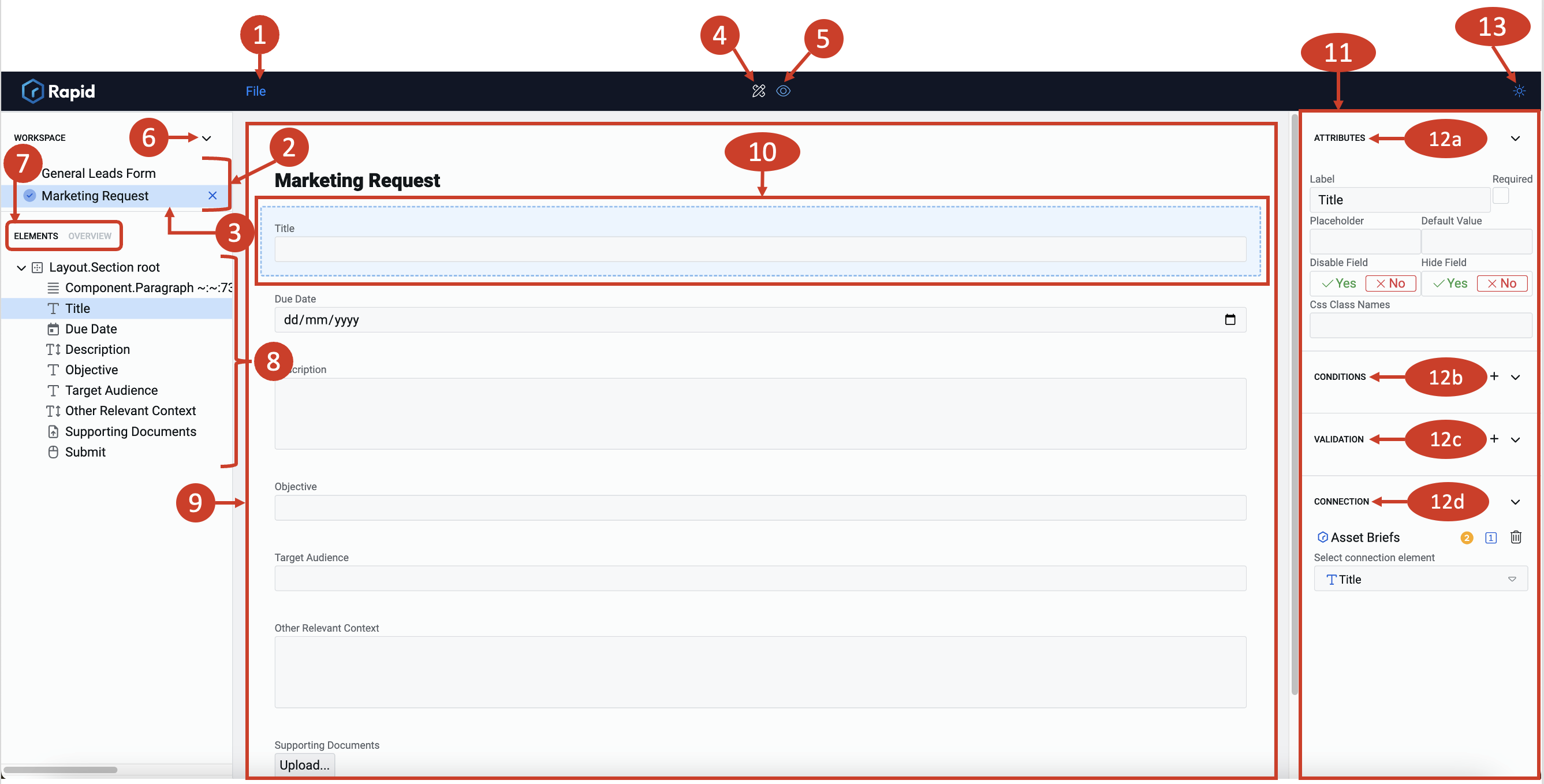
This area holds the title for all open forms. We can refer to this as the Workspace section. You can click on any of the titles to activate the relevant form and edit it.
-
This is the title of active form. The system highlights the same with a light blue colour and a tick mark indicating that it is the active form. It is important to note that there can be one and only one active form in the workspace section.

You can close an active form by clicking on the "X" icon on the right side of the active form's title. Closing a form removes it from the workspace section. To close a form, you need to make it active by clicking on it once.
-
Clicking on this icon brings you to the Edit Mode of the active form. You can create or modify the elements of the active form, when in Edit mode.

-
Clicking on this icon brings you to the Preview Mode depicting how the form may appear outside designer canvas.

You can toggle between Edit and Preview Modes by clicking on their respective icons. The passive mode will appear in blue, while the in-action mode will appear in white.
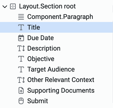
In the above image, the active form ("Marketing Request") is in Edit mode (because the icon appears in white).
-
This arrow icon can be used to toggle the appearance of Workspace section. Users may want to toggle off (or, collapse) the Workspace section typically when the Form Structure is too long.

-
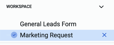
There are two tabs here - Elements and Overview. When Elements tab is active, then you can see the tree of elements for the form (defined in 8). When overview tab is active, then you can see and modify information about the form - like the form title, states, connections, etc.

-
This is the section which appears when the Elements tab is active (defined in 7). You can see the tree structure of elements for the active form. We can refer this as the Adaptive Document structure panel or the Tree of Elements section. This section houses all the elements added to the form. The structure may have elements nested within each other based on your desired configuration. You can scroll up and down to view all the components of the structure. You can click on any of the structural elements to view it on the Composition area (defined in 9).
-
This is the Composition area. Here you can add elements and also perceive how various elements will appear visually. Please note this is different from Preview.
-
This is the selected element. It appears with a blue highlight. The attributes of the selected element are visible towards the right in the Element configuration panel (defined in 11).

-
This is the Element configuration panel. Depending on the nature of the element, this panel will display different configuration categories.
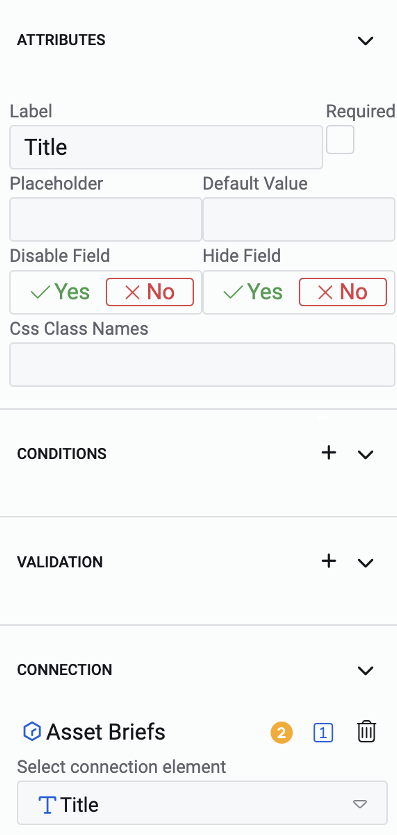
-
These are the configuration categories, which include: a. Attributes - allows the user to define how the element appears

b. Conditions - defines logic which governs when the element can be enabled, or appear, etc.

c. Validation - is used to set element-level validation criteria. This can be used for preventing users from submitting the form when there are empty fields, or unusual data is entered

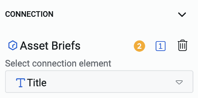
d. Connection - defines which tables in the database are connected to the elements on the form
e. Event - defines what actions can be triggered when clicking button elements
f. Choice - defines the choices that will appear in a dropdown or choice elements
Based on the nature of the elements selected, configuration categories will appear in the Element configuration panel (defined in 11).
-
This is the button to toggle between the dark and light mode appearance.
